 How does the market look to itself? Not to human traders, bots, or journalists, but to the invisible eyes behind the invisible hand.
The simplest version of this question is to map market assets based only on how they behave as assets, not what we know about the companies. Whenever two very dissimilar companies have stock prices in lockstep, or two companies that look similar to us have divergent stock prices, there's a difference between the market's perception and our own.
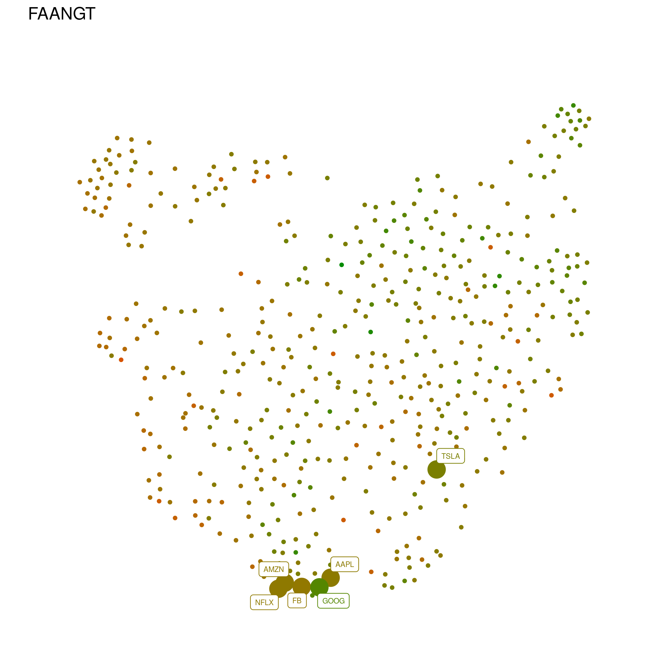
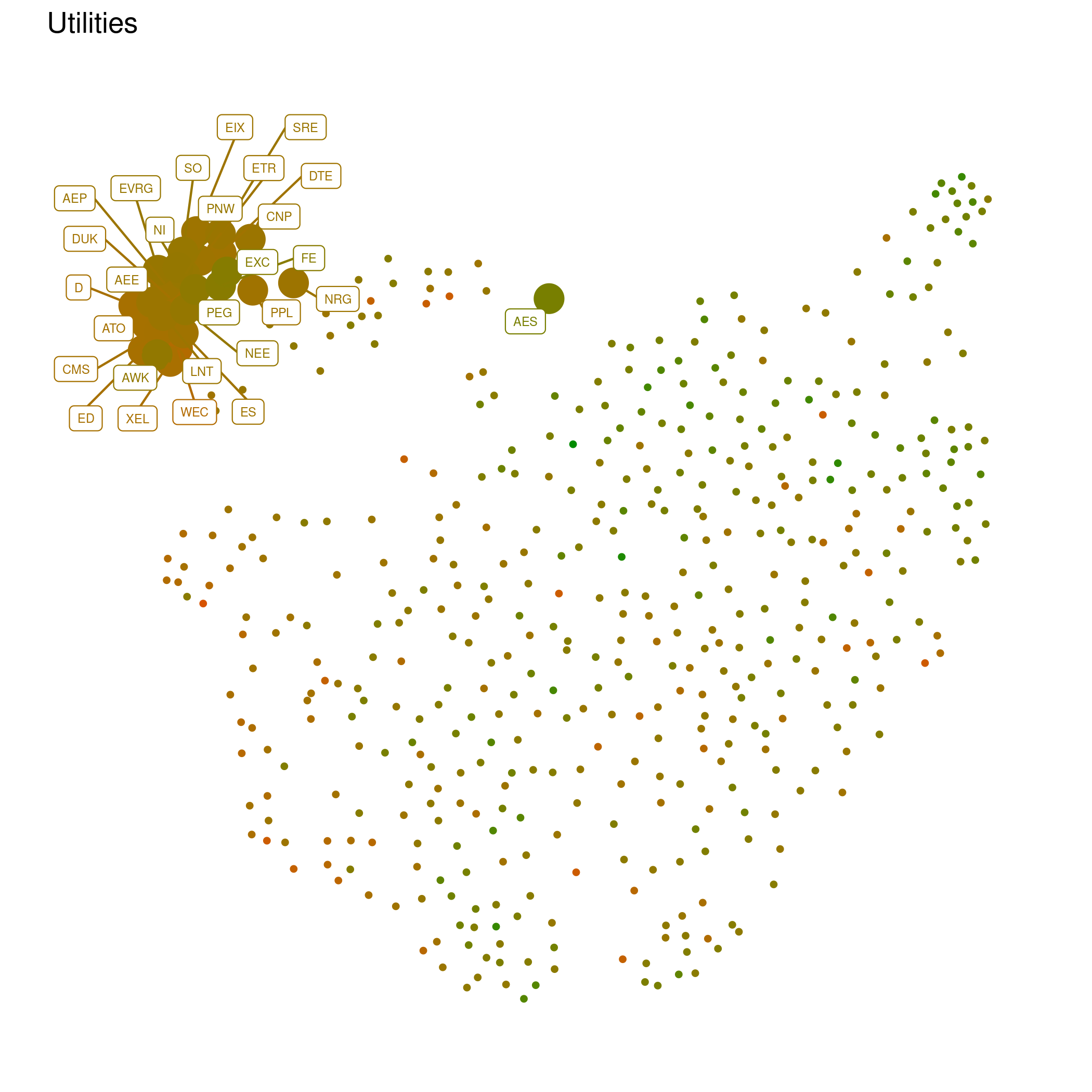
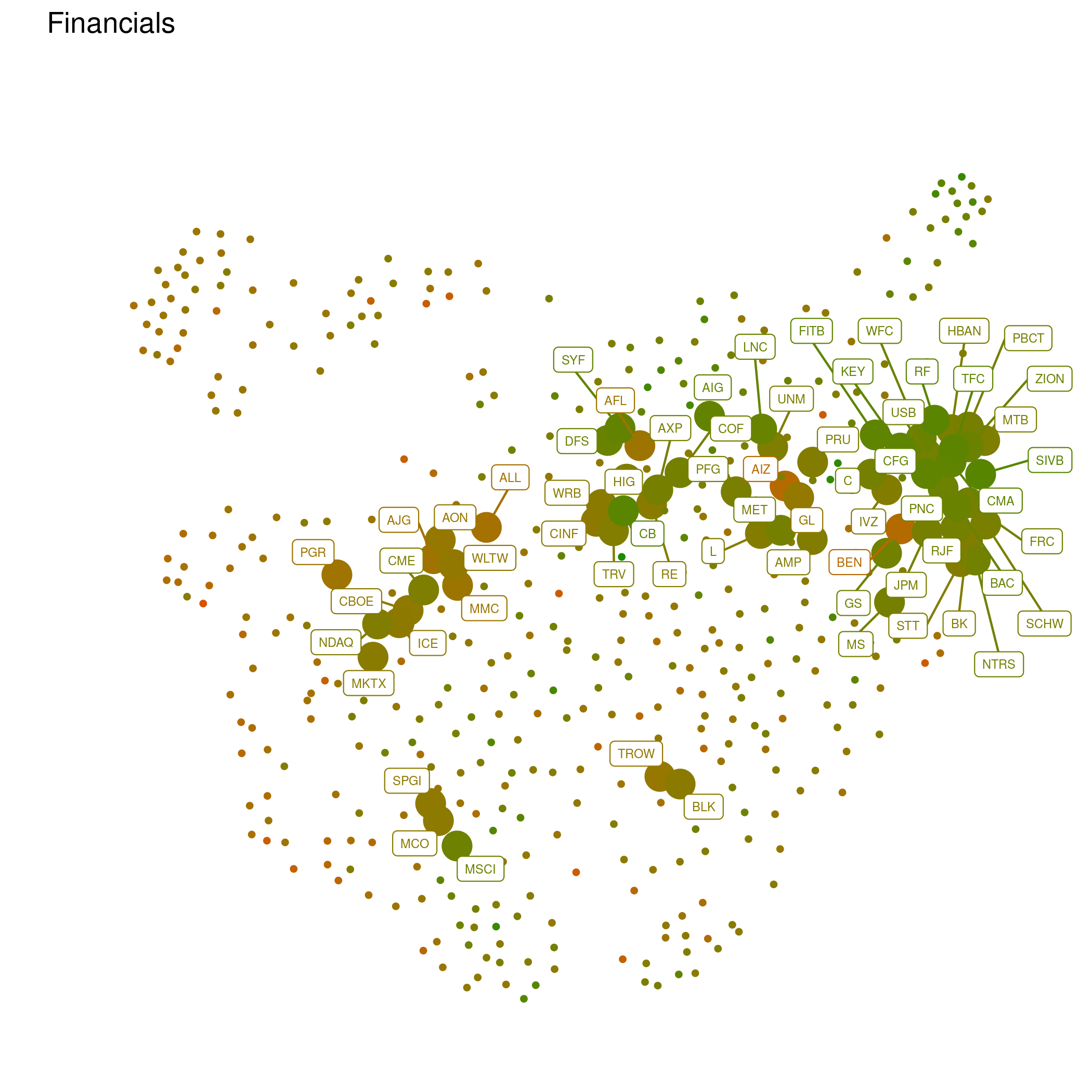
One of the uses of data science is precisely that, to attempt to see something using new frameworks; there's always one, whether deliberate or not, so it pays to explore different ways to look at the world, and the most interesting ones are often the least "human." So we can apply standard data analysis tools and try to see how the S&P 500 looks, as a whole, to itself. None of these technical choices is unique or necessarily optimal: I used the Pearson correlation between weekly returns to build a metric between stocks, and then the well-known UMAP algorithm to transform that metric into a two-dimensional map of the market.
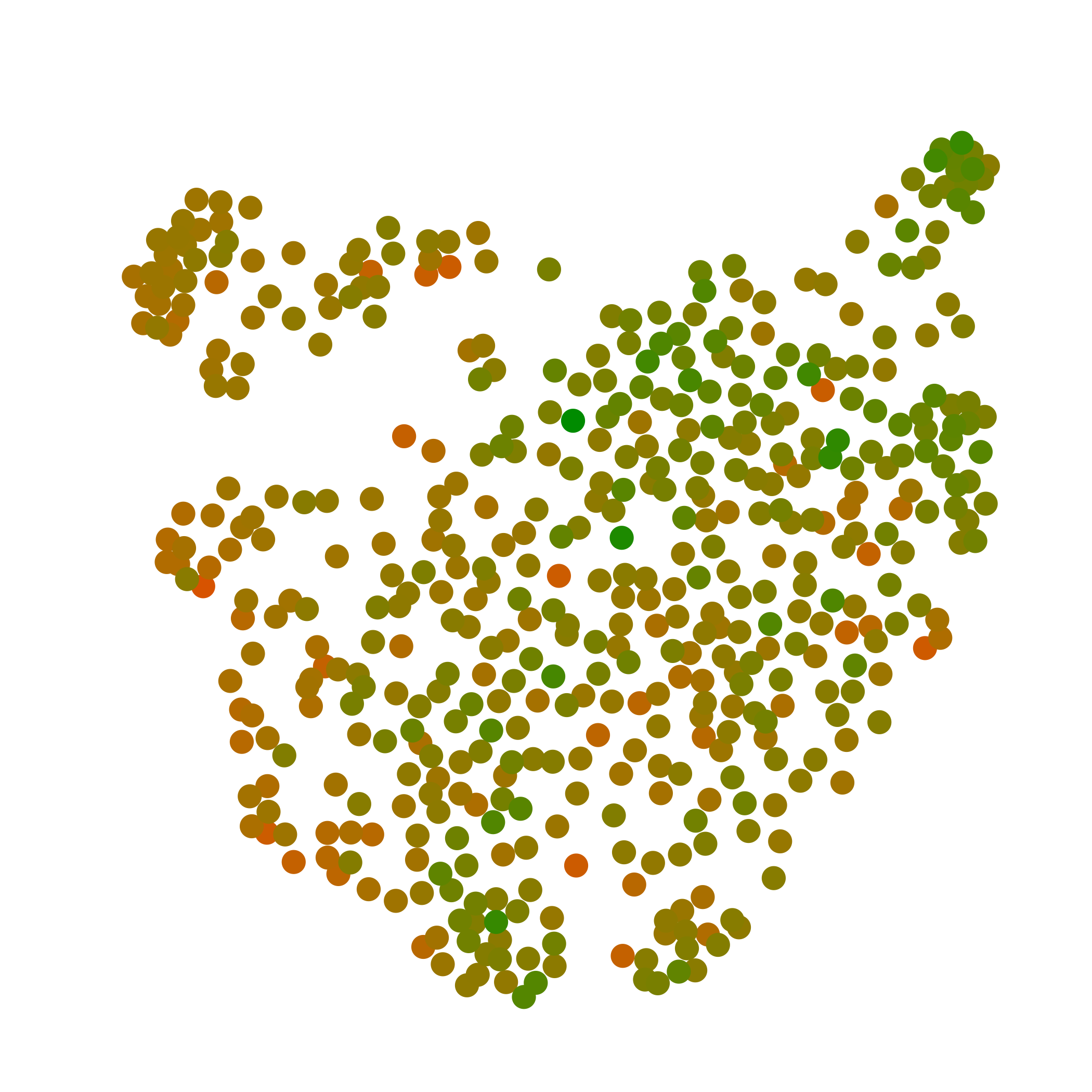
This is a map, among many possible, of the shape of the S&P 500:
Every point represents a company, with close ones having similar price histories, and distant points dissimilar ones. This makes more sense when seen with labels for specific groups of companies, like the "FAANGT" (Facebook, Amazon, Apple, Google, and Tesla)
utilities
or financial companies
In the somewhat weekly updated Seeing Like the Market dashboard, you can see how different sectors of the S&P 500 look like — the market's ideas are not always ours — as well as the best and worst performers of each week.