Getting even a rough idea of how comparatively good or bad have been countries'responses to COVID-19 is not just politically fraught, but also has specific technical difficulties. Some of the most obvious:
- Uneven (and even "tactical") testing.
- The impact of temperature: the epidemic is less severe during summer months, which can be misconstrued as success.
- Differences in economic resources among countries at the beginning of the pandemic.
- An understandable tendency to focus on the last snapshot instead of the whole history of the response.
The COVID-19 Country Response Scores dashboard is a simple first approach at adjusting for some of these problems. Updated monthly, it attempts to evaluate the skill with which countries have so far managed the pandemic as a whole by
- Focusing on deaths rather than cases, the consensus being that, while still an understatement of the true impact of the pandemic, reported deaths are a more robust metric.
- Fitting a simple model of the impact of average temperature (by month and country) on deaths, which does a bit to put on the same footing countries with very different climates.
- Adjusting as well for potential impact of differences in economic resources (using the 2019 GDP as a proxy).
- Evaluating countries by their results over the whole history of the pandemic, not just the latest period.
To do this, the dashboard depends on the extraordinary COVID-19 Data Hub, together with some other public domain information sources. I excluded from the analysis countries with limited or dubious data; this is ultimately a judgment call constantly open to revision.
The dashboard calculates a score for a country's response by evaluating deaths per million people every month, adjusting for past GDP and average temperature for the month, and then estimating a country-specific adjustment factor that accounts for how much the country performs better or worse than expected by this model.
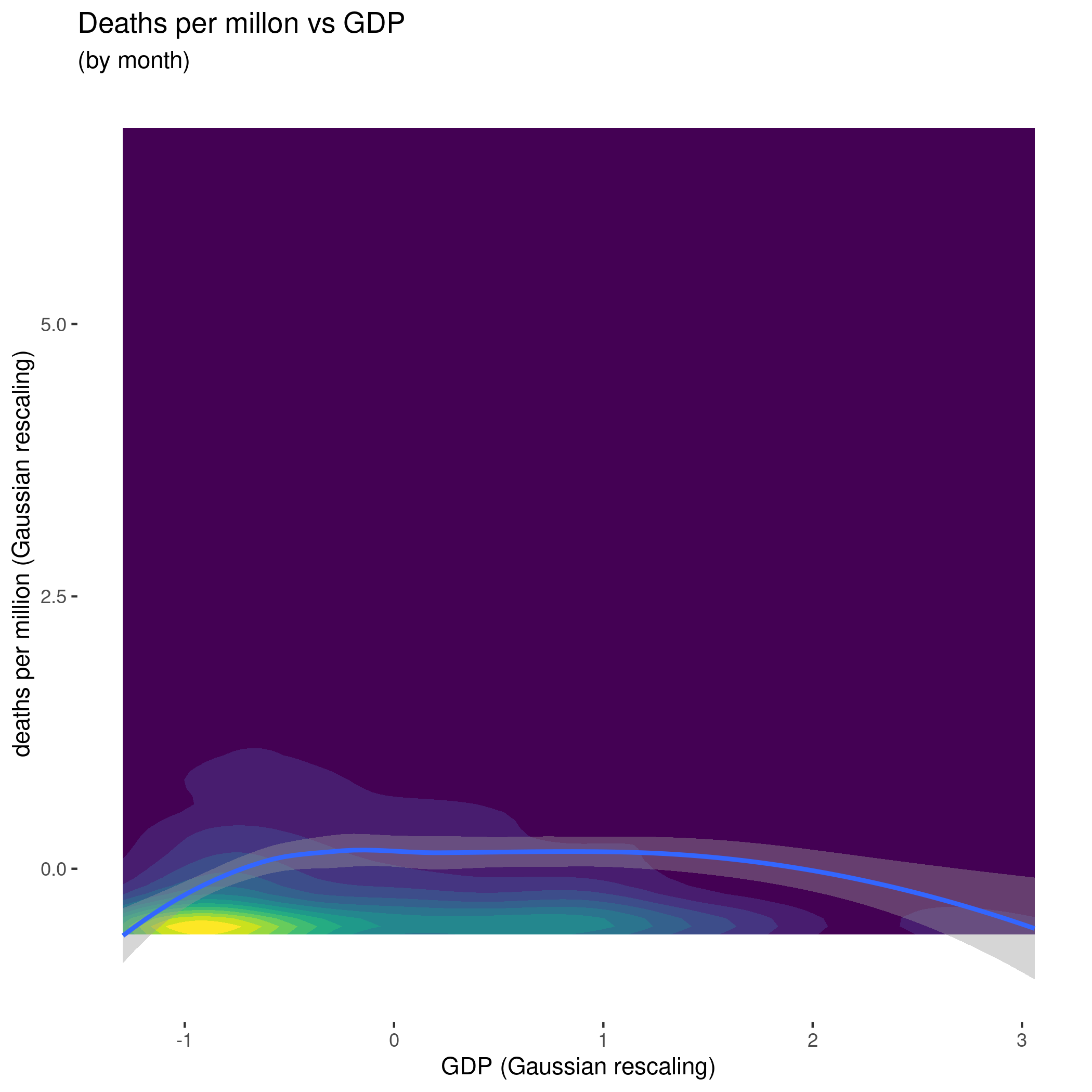
Looking at the impact of GDP alone, it's interesting to note that, empirically, middle-income countries have done worse than the richest and poorest countries — although it's not really a strong effect. It would be important to understand why (is it a matter of population density, social mores, resistance to centralized measures, the relative importance of cheaper public health preventive measures, something else?).
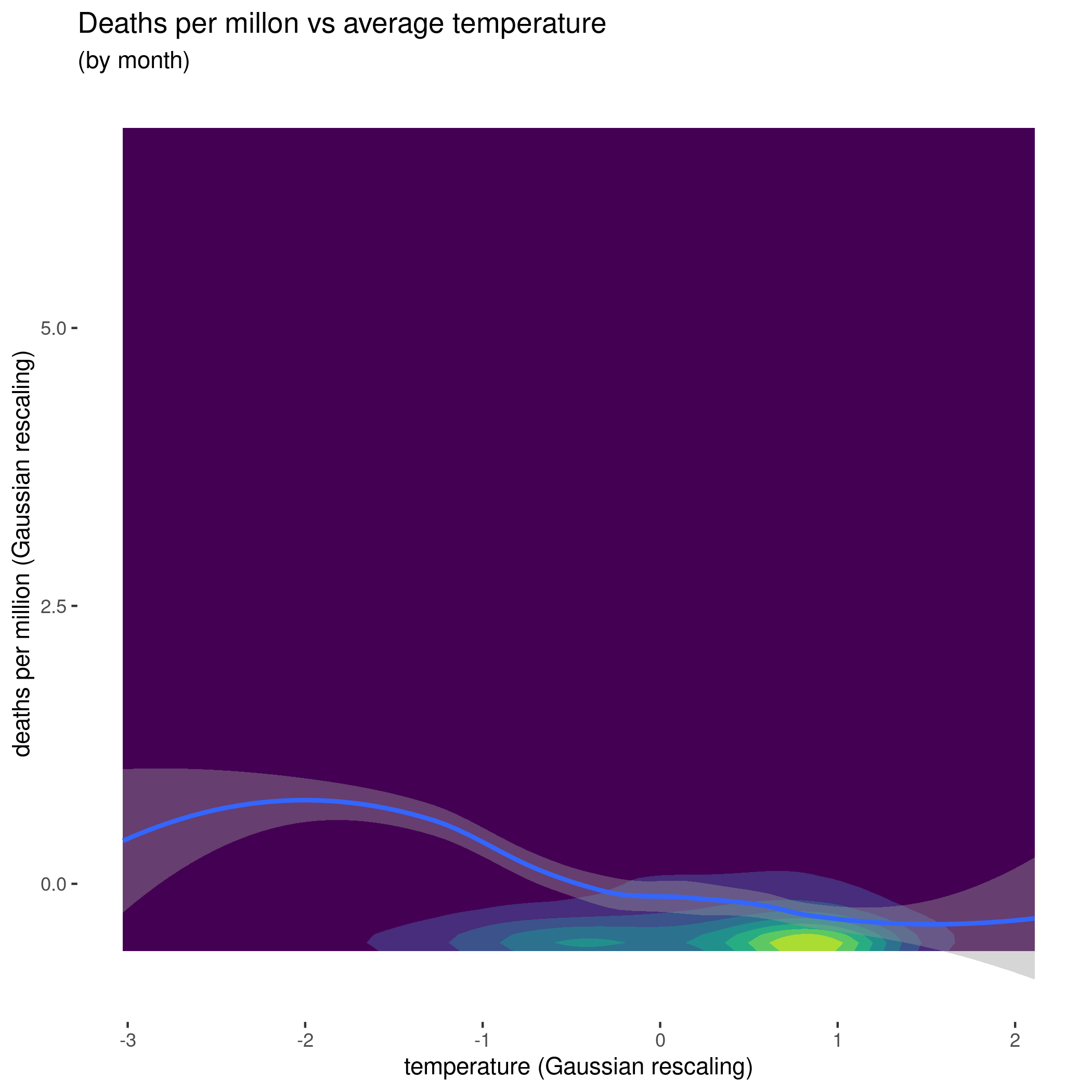
The impact of average monthly temperatures is in line with expectations, with colder temperatures associated with higher numbers of deaths:
Note: Since the Feb 2021 update, the model also takes into account the impact of age (through the percentage of the population in the lower-risk 15-64 age range) and population density.
The strategy to estimate the skill of the response to COVID-19 is then to generate an statistical model of how many deaths are "expected" given the past GDP and climate of a country in a given month, and looking at how much better or worse the country did in reality. Normalized, this "excess deaths" number gives us an score that we can use to rank countries in a way that adjusts the raw number of deaths per million people, sometimes changing the relative ranking between countries.
This is a small slice of the table on the dashboard ("#1" is the best, "#2" is second-best, etc):
| Country | Adjusted score | Score Rank # | Deaths per Million | Deaths per Million Rank # |
| Argentina | -0.93 | 66 | 971.92 | 68 |
| Australia | 1.41 | 10 | 36.39 | 14 |
| Austria | 0.48 | 19 | 713.99 | 56 |
| Bangladesh | -0.09 | 43 | 46.85 | 15 |
| Belgium | -2.02 | 76 | 1716.13 | 77 |
When looking at the dashboard, it's important to remember that the deaths per million column is as of the date indicated on the dashboard (Dec. 31, 2020 for the first update as described in this post), but the adjusted score is over the entirety of the pandemic. So a country can be doing comparatively well now, but that may be because it's summer, or perhaps a genuine improvement after a generally bad handling of the pandemic; the adjusted score attempts to take both possibilities into account.
To emphasize, it's not an epidemiological model, nor a predictor of any kind, and it's not intended to be used to argue for or against specific measures (or, of course, governments). As the note on the dashboard says, there are no winners here: from the way political repression hushed critical early warnings in China, to whatever sort of rabid embrace of suicidal ignorance drives significant aspects of politics in places like the United States, Brazil, and the United Kingdom, to the shambolic vaccine evaluation and logistics of Argentina and Venezuela, almost no government in the world can look back to 2020 with the grim satisfaction of having handled competently a difficult situation.
But the habit of constantly attempting to contextualize and understand "success metrics" — the never ending job of disentangling skill, luck, and advantage, so we can replicate and improve the former — is an important one for everybody from individuals to small groups to the global society. Something we have mostly handled very poorly can still be something we learn from. We just need to make sure we learn the right things.