"The news" is best seen as an intermediate good; it's not something you consume as-is, but rather something you process to get answers to your questions. There are many questions that different sites and tools attempt to help answer, including "what just happened?," "what is most relevant to my interests?," "what do (some subset of) other people way think is relevant?," etc.
One question that is addressed less often is that of the "surprising". Not what's being written or read about the most, or by the largest number of people, but rather what's being written about more often than statistically expected given the way it had been talked about in the past. So — to use late 2020 examples — a handful of articles about the Brooklyn Nets can be more "surprising" than a much larger number of articles about COVID-19, because the later had been written about a lot recently, while the Brooklyn Nets hadn't. It's far from the only useful concept of interestingness, which is also part of the point: like any other data set, there's not a single useful way to look at the news. But it's an useful one to pick up rising trends regardless of their size.
The What's New in News dashboard is an informal tool I've written to do just that. Driven by data from the quite fantastic New York Times APIs and updated weekly — with absolutely no guarantees — it's a look at the topics that were covered by the NYT in a surprising large number of articles.
The interface, such as it is, is very simple:
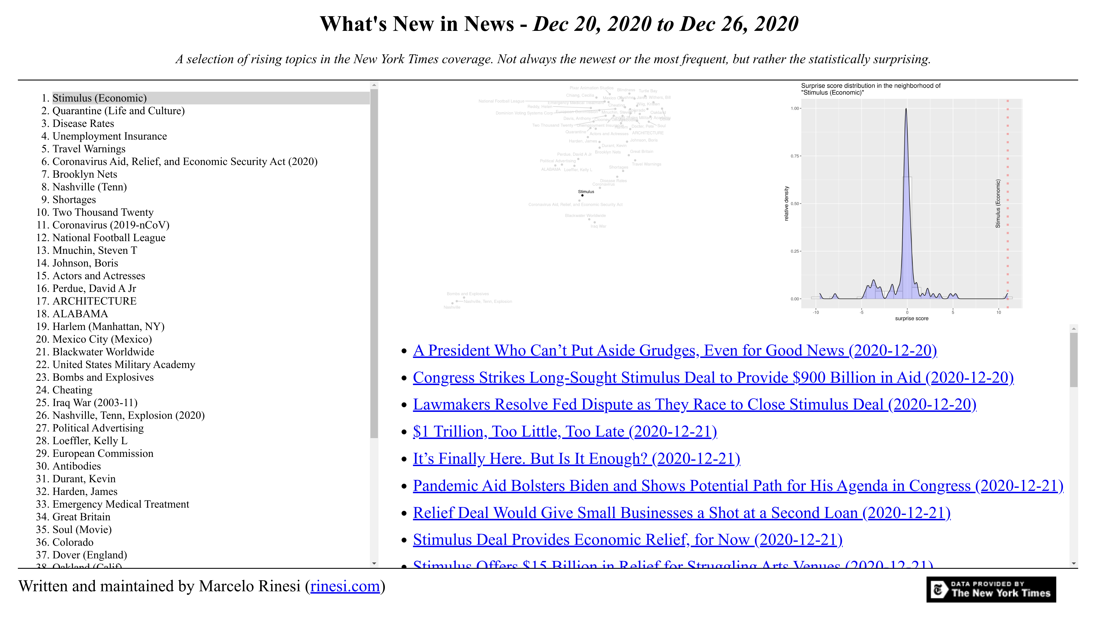
To the left there's a list of the fifty "most surprising" topics. Clicking on them loads into the bottom-right panel a list of links to all the NYT articles written about that topic during the week.
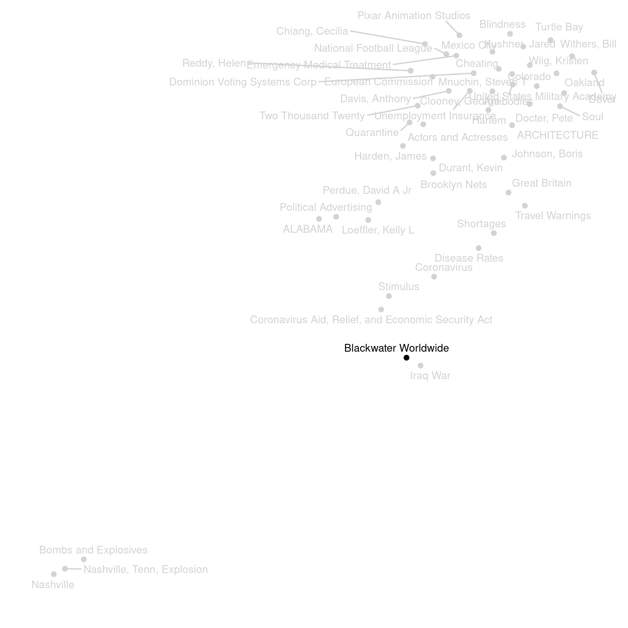
The two smaller panels at the top are a bit more experimental. The leftmost panel shows a topic map representing relationships between the topics based on how often they are talked about in the same articles. For example, in the map below Blackwater Worldwide is paired with Iraq War, as the company was in the news linked to events that happened during that war.
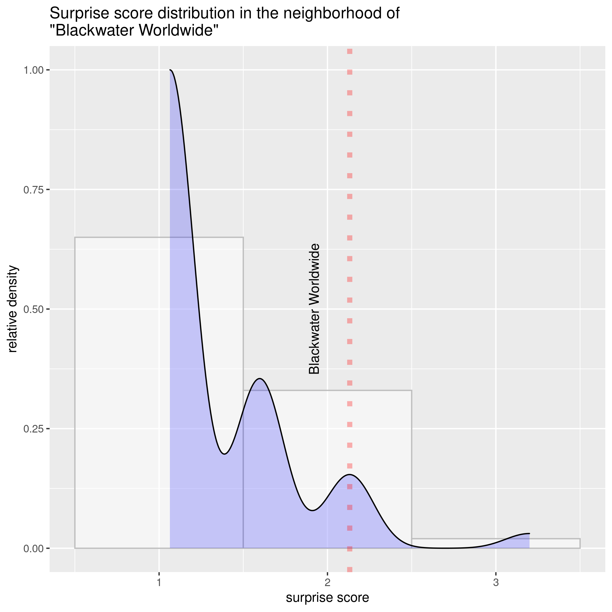
The final panel on the top-right corner explains why the system thinks the topic is interesting. In short, it fits a very simple statistical model to try and predict how many articles will mention each topic in the last week, and then assigns a "surprise score" to each article based on how wrong it was (focusing on the topics that got more articles than expected). The graphic shows the distribution of surprise scores for topics with a pattern of past mentions similar to the selected topic, and the selected topic's specific surprise score. In a very approximate way, it gives an idea of how surprising the topic is among similarly frequent topics: the more to the right the red line, the more surprising the topic's level of coverage was.
So there you have it. You can check it weekly to get an idea of (one version of) what's signal among the noise in news, or even take the idea and run with it in some other direction, but, if nothing else, I hope it illustrates that there are many more ways of approaching the news in an algorithmically active way than just going with what matches a list of interests or what other people have chosen to read or share. Besides telling software what you are interested on, there's also value in thinking about what meaning of "interesting" is most useful for you today.